A Completely Unnecessary Redesign
16 May 2013
Posts in This Series
- Part I: A Completely Unnecessary Redesign
- ...in which the redesign of this site is announced.
- Part II: The Path Ahead
- ...in which the redesign process is outlined.
Personal sites are often designers’ “forever projects”: ones that are in a perpetual state of being in need of “just one more” feature or tweak. This one is no different, having gone through five iterations in the past several years. If I were to be completely honest with myself, I could easily consider it “done”: the design, while not spectacular, caters well to my intended audience, I have the ability to easily add and edit content with a low-friction workflow, and the site affords users the ability to see my recent online activity and get in touch if they so desire.
Yet I, along with my designer and developer contemporaries, continue to be unsatisfied with our online presences. Not, in my case, with the visual design, or with the features, or even with the way my GitHub activity displays on the “contact” page (when it works), but with the fact that I’m not actively developing on it. In a way, I’m worried it’s representative of my current position in the industry: resting on my laurels, and not striving to expand my horizons.
Of course, this is unfair, as the frequency of updates to my personal site is often inversely proportional to the amount of other work I’m doing elsewhere. My personal site is often updated out of sheer boredom and speaks to a lack of other projects on which I can spend my free time. So when I announce that I’m embarking on the design of a new edition of the site, as I’ll do shortly, you may safely assume I simply have too few other projects and distractions…but you would be wrong (this time).
Version Six
I’ve always been a “designer”, as I work just as often with pixels and Bézier curves as I do with variables and functions, but I’m predominately self-taught. I get glimpses of what it’s like in the pure-design realm from those I follow on Twitter and the blogosphere, but I’ve yet to completely divorce myself from the world of “back-end development”.
Yesterday, I began working with a new client where I’ll be doing just that: providing not code, but information architecture, content strategy, and eventually, visual design, for a sizable application. Coincidently, I also just returned from the Artifact conference—featuring outstanding speakers such as Dave Rupert (@davatron5000), Christopher Schmitt (@teleject), Jason Pamental (@jpamental), and Brad Frost (@brad_frost)—with a new perspective on the concept of “design” itself. The former has outlined some of the areas I feel need improvement (I create style tiles, but do I really comprehend style tiles?), but the latter has given me some perspective on where to start connecting the dots.
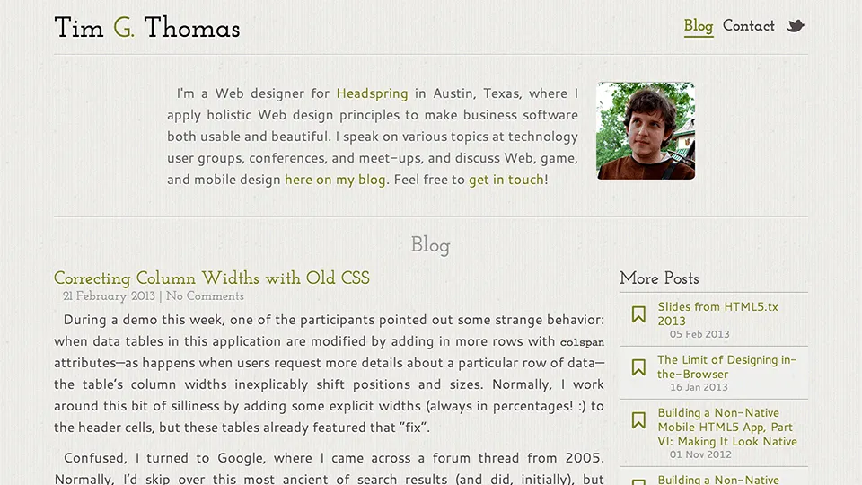
As always, listening to presentations and reading blog posts only goes so far: to truly understand a topic, you must both do it and explain it to someone else. To this end, I’ll be going through a complete—and very public—redesign of this blog, from wireframe sketches to HTML, from style tiles to CSS, and from content surveys to CMS integration…and blogging about the entire process. To begin this journey, I leave you with a screen shot of the way my blog looks today, and my excitement (and more than a little anxiety) of sharing this process with you. Here’s to unnecessary redesigns!
