Building a Non-Native Mobile HTML5 App, Part VI: Making It Look Native
31 October 2012
Posts in This Series
- Part I: A Business Case
- Why our client chose to build a Web app over a native one.
- Part II: Choosing a Technology Stack
- How we chose our tools and technologies, and what we picked.
- Part III: Hooking Things Together
- Wire up a client and server with JavaScript and .NET.
- Part IV: Making It Work Offline
- Store data locally and synchronize it with a server.
- Part V: Testing the App
- Develop and test for a mobile device.
- Part VI: Making It Look Native
- Leverage some tricks of Mobile Safari to make a site look like an app.
In this series so far, we’ve mostly discussed building a back-end for our non-native, offline-enabled mobile HTML5 app. Today, however, we’ll see how to make the app look a little more native.
Though it’s perfectly reasonable to expect users to experience your app through the lens of some mobile Web browser, some devices allow Web sites to be “pinned” to their app list, thereby appearing much like any native application would.
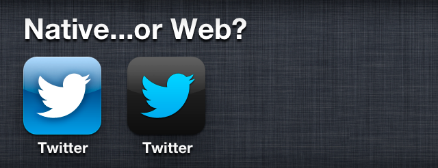
In this post, we’ll look at how to see your app as a native user might, correct some obviously-non-native Web site usability, and make your app shine on iOS device home screens everywhere.
Using Chrome’s Web Inspector overrides
One of the easiest ways to visualize how your app will appear to users on mobile devices is to view it in a browser at some native resolution. The awesome Chrome browser makes this quite easy: using the Web inspector (Menu > Tools > Developer Tools), click the “gear” icon at the bottom-right of the window that appears, and switch to the “Overrides” tab. Here, you can change the user agent reported to the currently-active page, spoof geolocation data, and, most importantly for us just now, change the device resolution.
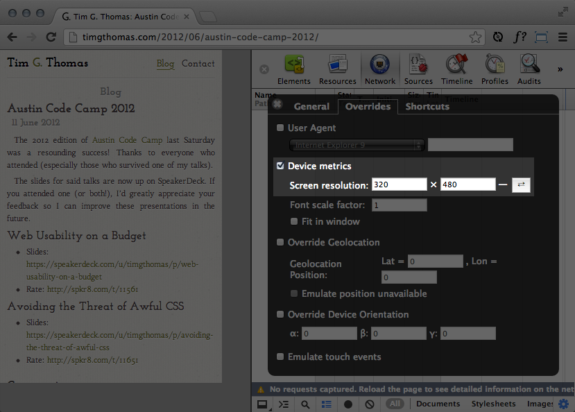
One catch to this feature involves high-DPI screens, like those found on newer iPhone and iPad models: the values you should use for this option are of the effective resolution of the screen, not the actual screen dimensions. Thus, an iPhone 4S, with its native resolution of 640×960, displays Web sites’ text and layout as if it were a screen of 320×480. The same goes for iPad models, too, which (currently) all show sites as if they had 768×1024 screens.
Prohibiting zooming and preventing scrolling
Most native applications are designed to target specific screen sizes, so it’s rarely necessary to zoom and scroll around an app window. Unfortunately, the Web isn’t designed for a particular screen, and these actions are often required to see the full content of a page. In our attempt to make an app look and behave as much like a native one as possible, these interactions simply have to go.
It’s fortunate, then, that many browsers support the <meta name="viewport" /> tag. This tag allows us to request specific constraints on how sites are viewed in a browser. Allen Pike, of Steam Clock Software, wrote an excellent article on the topic, but the syntax is easy enough to (mostly) remember over time:
<!-- Prevent users from zooming the site. -->
<meta name="viewport" content="user-scalable=no" />

<!-- Default the site's size to the device's resolution. -->
<meta name="viewport" content="width=device-width" />

<!-- Feel free to combine rules, as well. -->
<meta name="viewport" content="user-scalable=no, width=device-width" />
As a best practice for most devices, Mr. Pike suggests the following combination of viewport rules (see his site for more details), which prevents unexpected scaling of your site to larger screens:
<meta name="viewport" content="width=device-width, maximum-scale=1.0" />
iOS device enhancements
If you plan to target your app to iOS devices, you get some excellent additional tools to further blur the line between “native” and “Web”, provided in the form of <meta> and <link> tags that iOS browsers understand. Apple’s iOS Developer Library provides excellent documentation for these features, but they, too, are quite easy to remember.
Browser chrome
Two attributes you’ll want to include for all of your iOS-targeted Web applications inform the device that your app was designed to be “pinned” to the start screen, and remove the browser chrome (which would otherwise completely shatter the illusion of running a semi-native app):
<meta name="apple-mobile-web-app-capable" content="yes" />
<meta name="apple-mobile-web-app-status-bar-style" content="black" />
Home screen icons
It’s also quite easy to specify images to use as home screen icons. Since Apple’s devices have a number of different pixel densities, you can attach specific images to specific pixel sizes of icons:
<link rel="apple-touch-icon" href="/apple-touch-icon.png" />
<link rel="apple-touch-icon" sizes="114x114" href="/apple-touch-icon-retina.png" />
The Apple iOS Developer Library has an informative article matching icon sizes to devices and resolutions.
Splash screens
Native iOS apps show some sort of opening screen while they’re loading, so Apple provides Web developers a way to mimic this behavior:
<link rel="apple-touch-startup-image" href="/apple-touch-startup-image.png" media="(orientation:portrait)" />
<link rel="apple-touch-startup-image" href="/apple-touch-startup-image.png" media="(orientation:landscape)" />
One “gotcha” with this is that the landscape screen needs to be the same resolution as the portrait one…the exact same. This means that if your portrait image is 320×480 in size, your landscape image also needs to be 320×480, requiring a 90-degree rotation:
Wrapping-up
This concludes this series on building a non-native mobile HTML5 app. We’ve looked at some decisions that led to choosing a Web-based approach over a native one, discussed some tools and technologies to help, enabled communication between a client and server, stored data offline for times when users are in disconnected environments, reviewed how to test a Web app on a device, and, in this post, outlined some ways to make your Web app look more native.
As time progresses, and more and more Web sites are designed to not only work on, but designed for, mobile devices, I expect we’ll see even more tools provided by browser vendors and device manufacturers to help us build non-native mobile HTML5 apps. Still, the methods and tools available right now are better than any available before, and allow Web developers to make some truly incredible (non-native) apps. Thanks for reading!