Norwegian Usability
11 June 2014
One of my favorite parts about traveling internationally is the ability to see how other cultures design everyday objects and experiences. I had the opportunity to speak in Norway last week, and took note of some of my favorite examples of usability:
Hotel Room Keys
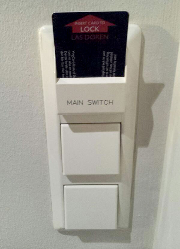
In the past year, I’ve had to request something like three or four additional room keys because I realized I hadn’t grabbed one…right after the room door slammed closed. What’s the solution? The locks in my Norwegian hotel wait for a full minute before engaging, giving you ample time to get to the elevator, remember you left your key, and rush back to the room. What’s more, you can turn the key card around and slide it into the lock to immediately bolt the door, ensuring you can only explicitly lock your room when you have your key card in hand.
In addition to the great at-the-door experience, the light switches just inside the room won’t even turn on unless a room key is inserted, providing both insurance that you don’t leave any lights on when you leave, and a convenient place to store your room key while you’re inside.
Light Switches
Speaking of lights, most light switches I’ve encountered in the States fall into one of two categories. On one side of the spectrum is the style of a tiny, protruding block of plastic. It’s difficult to manipulate without physically pinching the plastic block with two fingers: a feat practically impossible when you’re carrying bags of groceries in both arms, for example.
The alternative is a much larger flattened toggle switch: a “rocker”. While it’s certainly much easier to switch in the aforementioned grocery scenario, I’ve frequently found them to be too sensitive, often turning lights on (or off) when I gently brush past. Their flat shape also makes it difficult to see the switch’s position from far away.
In Norway (and many other countries), however, light switches take on a more thoughtful appearance (see the above photo). The switches are square and generally larger in size, and feature a flat rocker switching mechanism that sticks out some distance from the wall at it’s farthest point. The result is a switch that’s easy to turn on and off (but not too easy) without requiring large amounts of dexterity, yet sizeable enough to be easily seen from across a room.
Cigarette Trash Cans
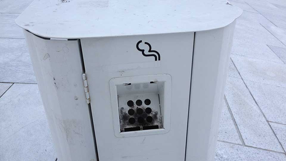
I’m not a smoker, but it seems many Norwegians are: I encountered a seemingly large number of them in Oslo. What I didn’t encounter a large number of, however, were cigarette butts, and I credit two things with this: one, the Norwegians’ apparent desire to keep their country clean (shocking, I know), and two, these cleverly-obvious trash cans. The punctured recepticle opening practically begs to have a spent cigarette disposed of therein.
Street Signs
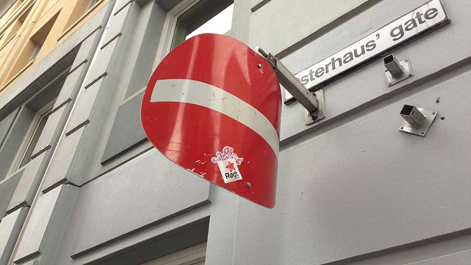
The street sign system in the States is adequate, but that doesn’t mean it can’t be improved upon. One of the signs I remember having a problem with is the “do not enter” sign: the graphic itself makes sense, but the signs are often oriented so that you can’t easily see them unless you’re almost directly facing the street you’re forbidden to enter. I sometimes find myself leaning to one side while driving to make sure the sign I’m seeing is, in fact, of the “no entry” variety.
The Norwegian signs of the same purpose feature an ingenious solution: curved metal. From straight-on, the signs appear just as they would otherwise. From a cross street, however, you can still clearly see enough of the sign to realize you shouldn’t make that turn.
Emergency Exit Signs
I’ve been fortunate enough to never need the help of an emergency exit sign, but I always felt I’d be of two minds if I ever did need its navigational assistance: on one hand, I, as a person in hypothetical need of an emergency exit, would be quite pleased to see a convenient and well-labeled escape route. On the other hand, I’ve been trained from a young age that the color red means “stop” or “don’t do this”. Fortunately, the Norwegians (among many other countries, to be fair) have solved this problem entirely: make the exit sign green. The Portal-esque iconography is a nice touch.
Shower Faucets
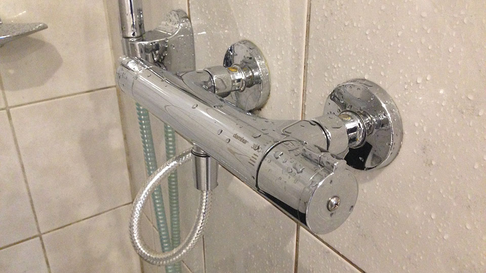
My least favorite morning ritual involves fiddling with the shower controls for fully half a minute trying to get the temperature just right. My hotel room featured the solution of my dreams: a shower that allowed you to specify the water’s temperature, in degrees, independent of the flow rate. When arriving at a suitably-equipped hotel—I had one in the UK last year, too—I just dial in the temperature before my first shower (a process that takes about three seconds) and never worry about it again.
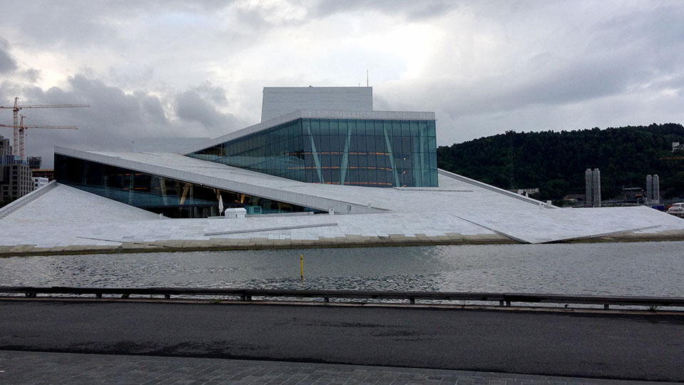
The Oslo Opera House
By far the most spectacular example of great usability I encountered on my trip, the Oslo Opera house is beautiful, iconic…and can be walked on. Almost the entire roof of the building is effectively a stone-floored plaza (that I’ve been told represents the Norwegians’ enthusiasm for mountain climbing), featuring breathtaking views of the city. What better example of usability than to turn something almost exclusively unusable for the public—a building’s roof—into something an entire city can enjoy?
Even though I interacted with (or sometimes just looked at) these items, experiences, and places only briefly during my trip to Oslo, I remember each one quite well: it’s amazing how some simple solutions to common problems can leave such a profound impact. What examples of great usability have you encountered on your travels?