Simple Validation Visuals for Windows Phone 7
4 August 2011
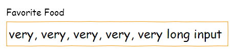
In the Windows Phone 7 app I’m working on, I’d like to provide some visual feedback for invalid input fields by outlining each one with the user’s selected accent color. Ideally, invalid input boxes would look something like this:
Unfortunately, WP7’s template-based styling model makes this difficult, and the workaround suggestions I’ve found result in significant amounts of markup noise (not to mention adding the necessary XAML for that approach just duplicates Silverlight’s internals).
One solution I’ve found to work well is to simply “stack” a pre-styled Border control on top of the TextBox you’d like to validate and control its visibility programmatically or with data binding (this example uses the former method). The markup is very straightforward…
  <Grid>
     <TextBox x:Name="FavoriteFood" />
     <Border x:Name="FavoriteFood_Validation" />
  </Grid>
…it’s easy to style to match the Metro UI…
  <Style x:Name="ValidationHighlight" TargetType="Border">
     <Setter Property="BorderThickness" Value="3" />
     <Setter Property="Margin" Value="12" />

     <!-- Match the user's accent color. -->
     <Setter Property="BorderBrush" Value="{StaticResource PhoneAccentColor}" />

     <!-- Don't interfere with the TextBox's tappable area. -->
     <Setter Property="IsHitTestVisible" Value="False" />

     <!-- Remain invisible until the user tries to submit bad data. -->
     <Setter Property="Visibility" Value="Collapsed" />
  </Style>
…and it’s trivial to show and hide to indicate validity.
  private void Validate()
  {
     // Perform some incredibly complex validation here, like so.
     bool favoriteFoodIsValid = FavoriteFood.Text.Length <= 32;

     FavoriteFood_Validation.Visibility = favoriteFoodIsValid ?
        Visibility.Collapsed : Visibility.Visible;
  }
Note that we’re taking advantage of the built-in Windows Phone 7 style resources so the user gets a customized color for their invalid fields. The Border control’s IsHitTestVisible property is set to False so it doesn’t interfere with users trying to tap in the TextBox, and we’re keeping the Border invisible until the input field is validated.
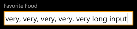
The end result looks something like this:
Happy validating!